Color Schemes That Pop
Color Schemes That Pop: Bold Wet Bar Ideas for Maximum Impact
A wet bar isn’t just a place to pour drinks—it’s a design opportunity. Whether it’s tucked into a corner, featured in a finished basement, or integrated into an open-concept living room, color is one of the most powerful tools you have to make the space shine. A bold or unexpected palette can turn even the smallest bar into a vibrant focal point. Here’s how to create wet bar color schemes that truly pop—while staying stylish, functional, and fun.
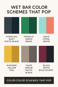
1. Moody & Dramatic: Charcoal, Navy, and Matte Black
If you want your bar to exude sophistication, moody hues are your friend. Think deep navy, charcoal gray, and even matte black. These colors bring an upscale, lounge-like feel, especially when layered with texture.
Pair with:
-
Marble or soapstone countertops
-
Brass or matte gold hardware
-
Integrated LED under-shelf lighting
-
Smoked glass or mirrored backsplash
This scheme is perfect for basement bars or media room setups where ambient light is controlled.
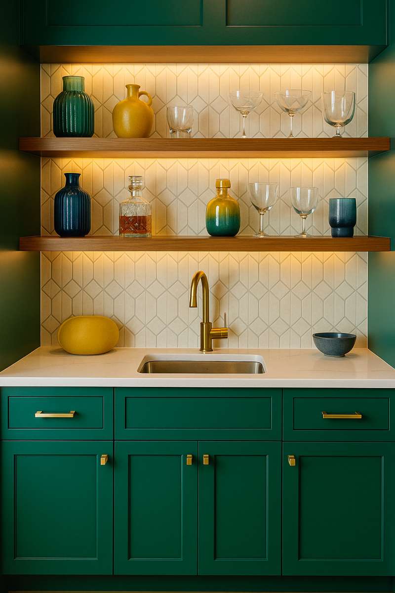
2. Emerald Green & Brass: A Luxurious Combo
Emerald green is bold, timeless, and deeply rich, especially when used on cabinets or tile. Paired with brushed brass accents, it creates a jewel-box vibe that works well in both modern and vintage homes.
Pair with:
-
Walnut shelving or warm wood tones
-
Fluted glass cabinets
-
Herringbone tile backsplash
-
Velvet stools or gold-trimmed glassware
This is a showstopper color scheme—and an unexpected favorite for formal living rooms or guest entertaining spaces.
3. Beachy Brights: Aqua, Coral, and White
For a breezy, coastal-inspired bar, lean into bright and cheerful colors. Aqua cabinetry, coral accessories, and white walls give off vacation energy all year long.
Pair with:
-
Rattan stools or pendant lights
-
Textured tile or beadboard
-
Matte black or stainless hardware
-
Open wood shelving
This color combo is perfect for pool houses, beach homes, or anyone chasing endless summer vibes.
4. Retro Revival: Mustard Yellow & Teal
Throw it back with a retro palette that still feels fresh. Mustard yellow and teal evoke vintage charm without feeling dated, especially when paired with modern materials.
Pair with:
-
Glossy laminate or quartz counters
-
Round mirrors or vintage bar signs
-
Patterned wallpaper or geometric backsplash
-
Chrome or black hardware
Add a record player and some mid-century barware, and you’ve got instant cool.
5. Monochrome Neutrals: Taupe, Greige, and Matte Black
Sometimes, the best way to “pop” is by keeping things subtle. A layered neutral palette adds depth and interest while maintaining a calm, curated aesthetic.
Pair with:
-
Textured stone or slab backsplash
-
Recessed or integrated lighting
-
Leather drawer pulls or bronze hardware
-
Minimalist bar tools and accessories
Ideal for open-plan kitchens or multipurpose living spaces where the bar should blend without disappearing.
6. Jewel Tones: Sapphire, Plum, and Ruby
For serious glamour, go bold with deep jewel tones. These saturated shades create drama and luxury in the best way.
Pair with:
-
Backlit shelves or under-cabinet lighting
-
Lacquered or high-gloss finishes
-
Crystal glassware or cut-glass decanters
-
Black marble or dark granite countertops
These tones work best in bars designed to impress—think formal parlors or entertainment lounges.
7. Black & White + One Bold Accent
Start with a crisp black-and-white base and add a single pop of color. It could be mint green cabinetry, a red tile backsplash, or cobalt blue stools.
Pair with:
-
Graphic tile or bold patterned wallpaper
-
Neon signage or framed pop art
-
Sleek metal or mirrored finishes
This look is perfect for modern apartments or loft-style homes with clean lines and bold energy.
Bonus Color Tips for Wet Bars
-
Lighting changes color perception—test swatches in the actual room before committing.
-
Balance bold cabinetry with neutral walls to avoid overwhelming small spaces.
-
Use your bar’s function to guide tone: darker palettes for evening lounges, brighter ones for daytime hosting.
-
Glossy finishes reflect light and are easier to clean, while matte finishes offer depth and elegance.
Conclusion
Your wet bar is more than a utility space—it’s a design moment. The right color scheme not only reflects your personality but also elevates the overall ambiance of your home. Whether you’re going sultry and moody or bright and beachy, don’t shy away from bold choices. After all, bars are meant to be fun.